Green: the color the eye stops arguing with
Half the photosites on a sensor are green, and that was our idea first.
In a camera's color filter array, two of every four photosites are green, against one red and one blue. The reason is not taste. Human vision peaks somewhere in the yellow-green, so the sensor spends most of its resolution exactly where our eyes were already paying attention.
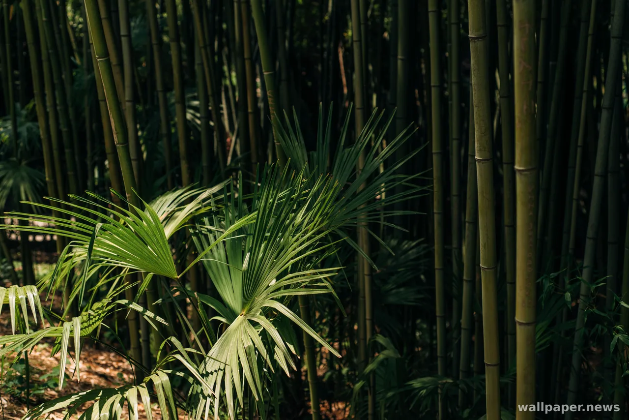
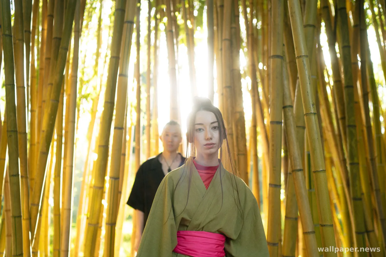
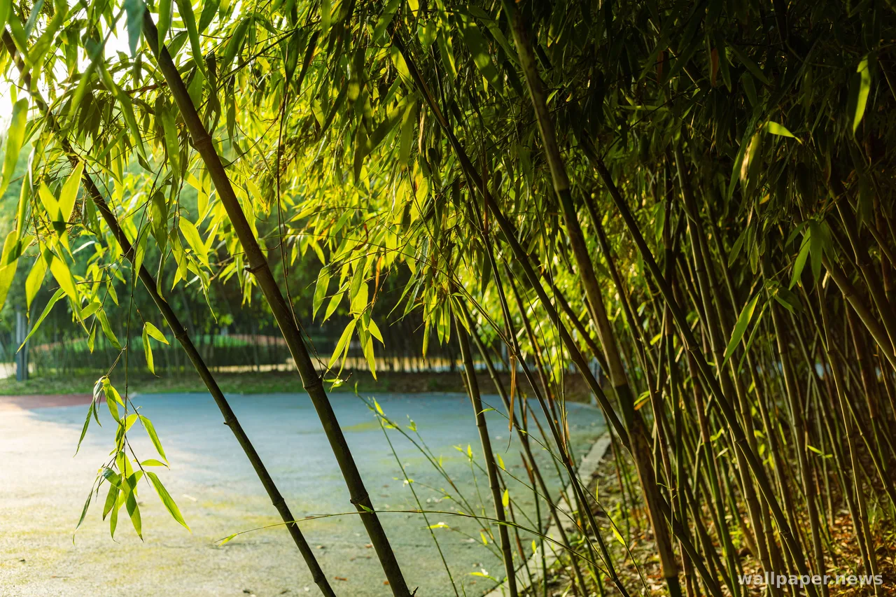
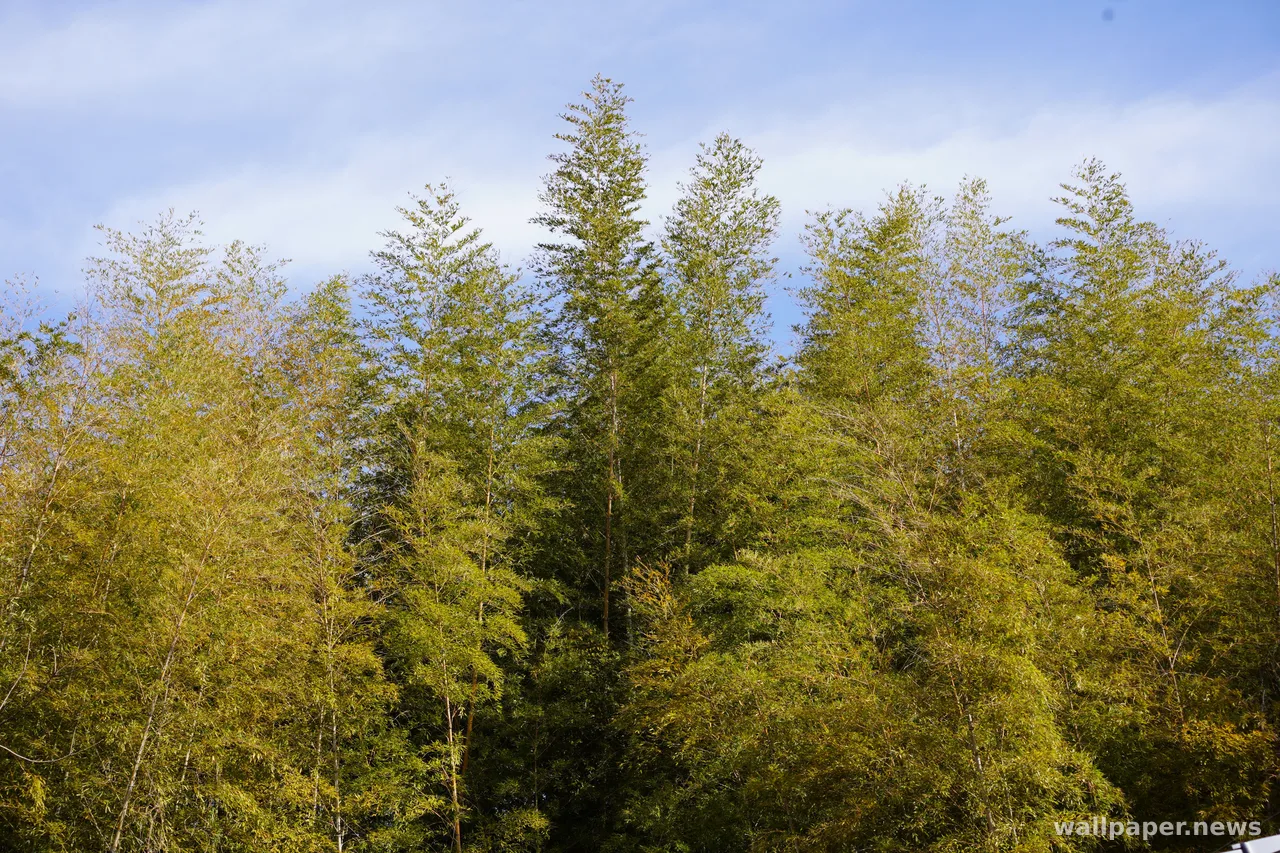
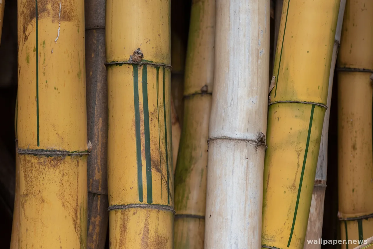
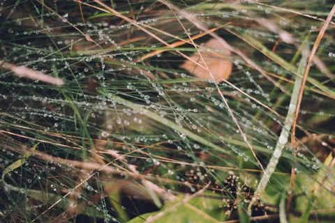
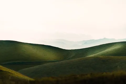
That sensitivity is also why a green photograph is never one color. Backlit leaves run yellow, moss in shade turns blue, a lawn at noon washes out to something close to grey. Frames that look monotonous usually just have flat light; give the same greens a slope of shadow and they separate into a dozen.
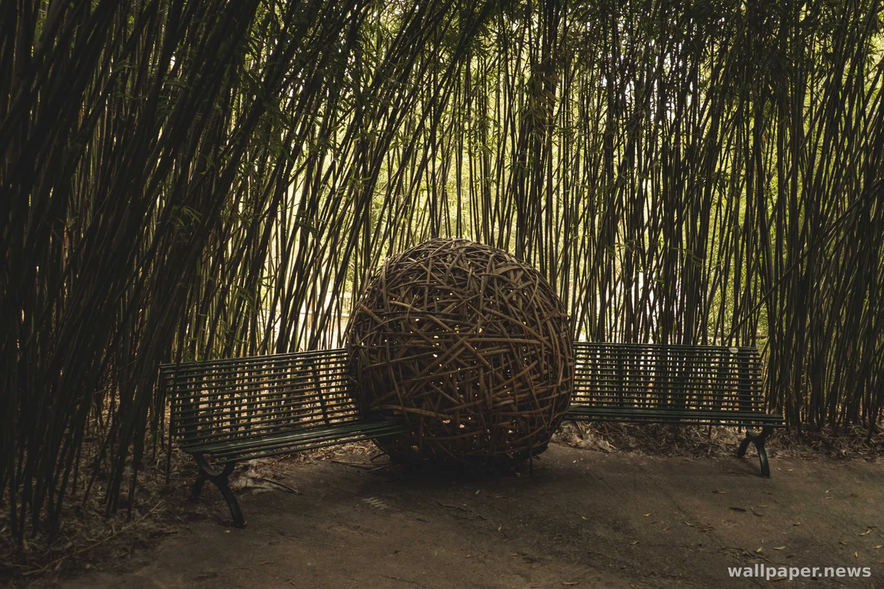
On a screen the advantage is quieter. Green at full width does not push forward the way red does, so icons and filenames stay legible over it without dimming anything. A dark canopy swallows a cluttered desktop; a pale spring green makes every label look sharper than it really is.