White: The Colour That Steps Aside
It offers no hue of its own, only brightness, and in exchange it makes everything beside it easier to read.
Very little in a photograph is actually white. Paper is faintly warm, a wall carries the colour of whatever is opposite it, and snow takes the sky. What the eye accepts as white is usually the brightest thing in view, adjusted on the spot, which is why the same wall can read as white indoors and blue from the doorway.
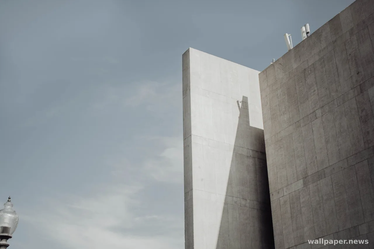
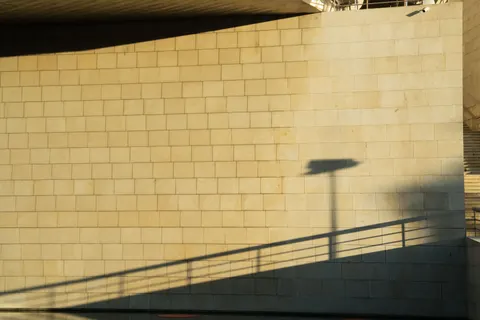
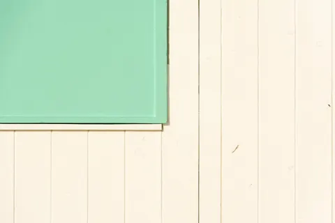
This is why the colour is useful rather than empty. Put anything next to a broad pale field and it gains definition, since there is nothing competing for attention and nothing tinting what arrives. Photographers who chase this look mostly manage exposure, not colour: hold the highlights just below the point where texture disappears, and the whole frame stays legible.
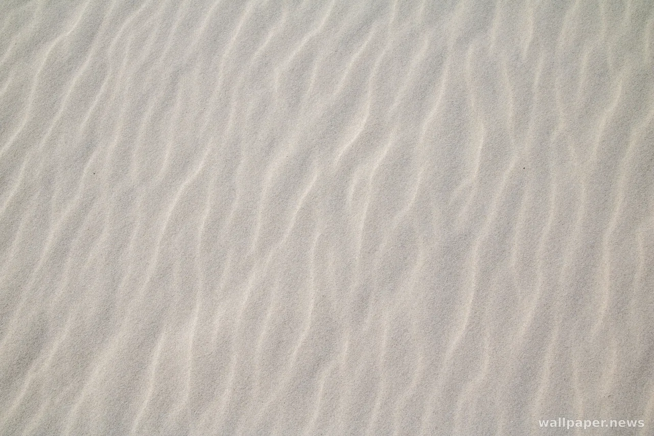
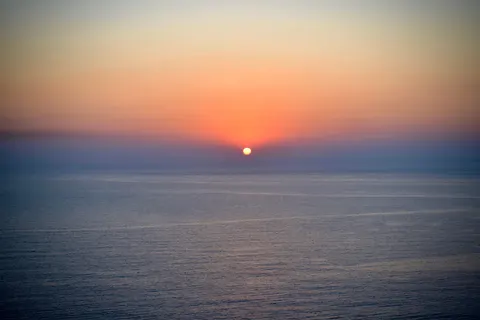
As a background it does the same favour for a desktop, provided the picture keeps some texture rather than going blank. Fresh snow, plaster, fog over a pale sea and paper all give a surface without asking to be looked at. The screen ends up brighter than a dark theme allows, but nothing on it has to fight for the front.