The Blue That Distance Paints
Why the farthest ridge is always the palest, and what the air is doing in between.
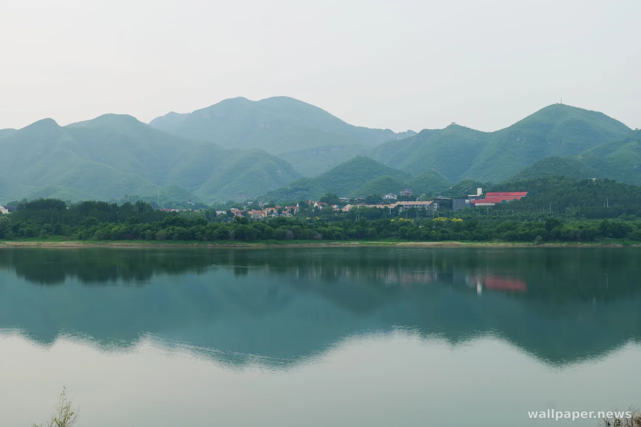
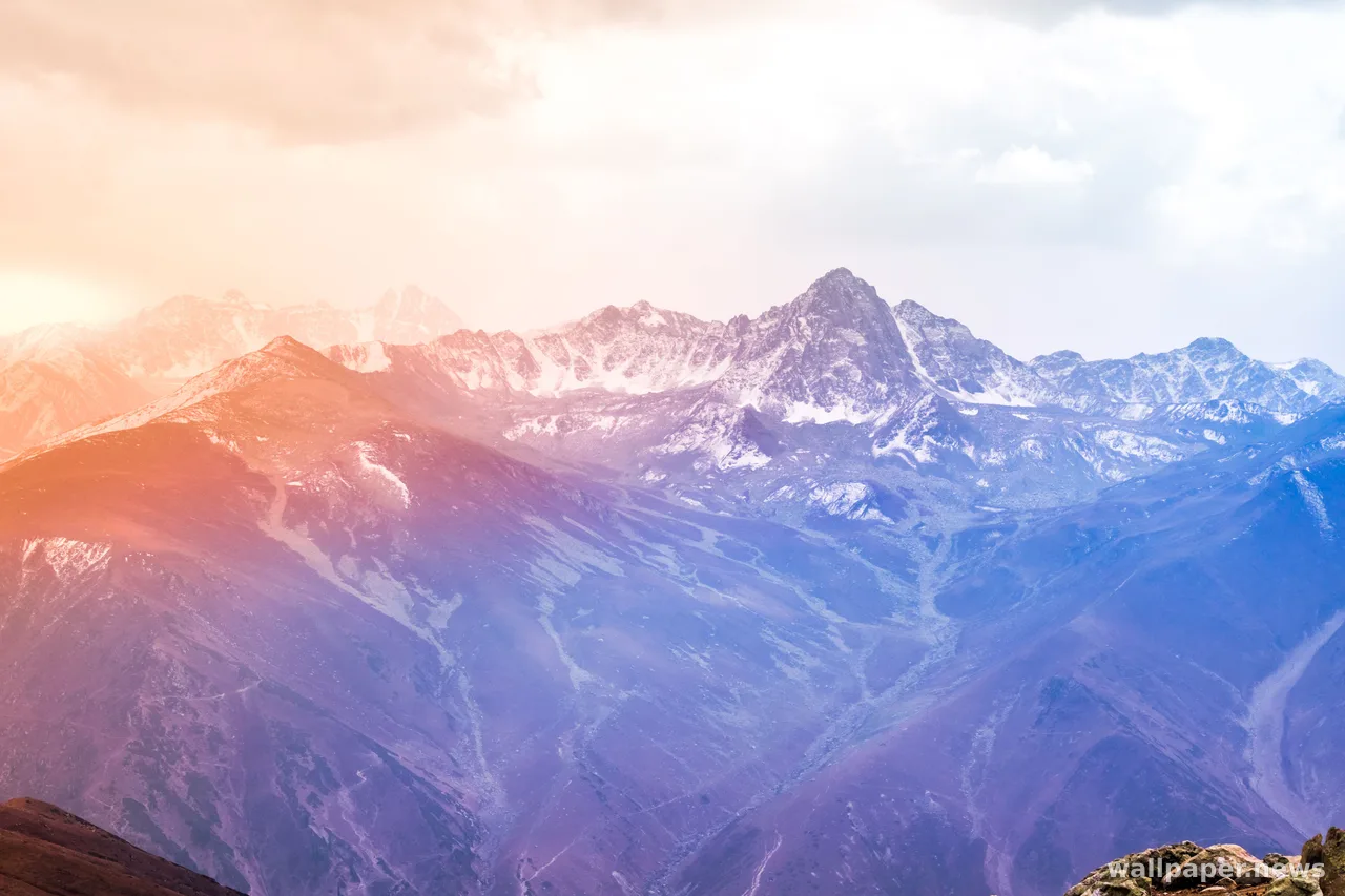
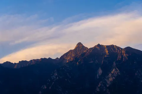
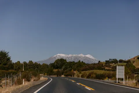
On a clear morning the near hills are green and specific; you can pick out single trees. The next ridge back is softer, greener-grey. The one after that is blue, and the last is barely a tone deeper than the sky. Nothing about the mountains changed. The air between you and them did.
Painters called it atmospheric perspective long before anyone measured it. Tiny particles and water vapour scatter the short wavelengths, so the more air you look through, the bluer and fainter a thing becomes. Distance, in other words, has a colour, and the colour is blue. A photograph of layered ridges is really a photograph of the air, made visible by the mountains standing in it.
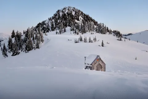
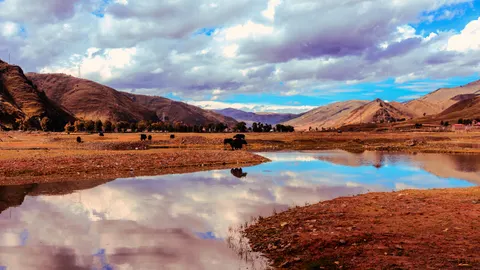
This is why the scenes rest so easily behind icons and text. The layers step back in even tones, contrast drops toward the horizon, and the top of the frame is almost empty sky, room for a clock, a folder, a line of unread mail. The far ridge does the quiet work a wallpaper wants: present, but never asking to be looked at.