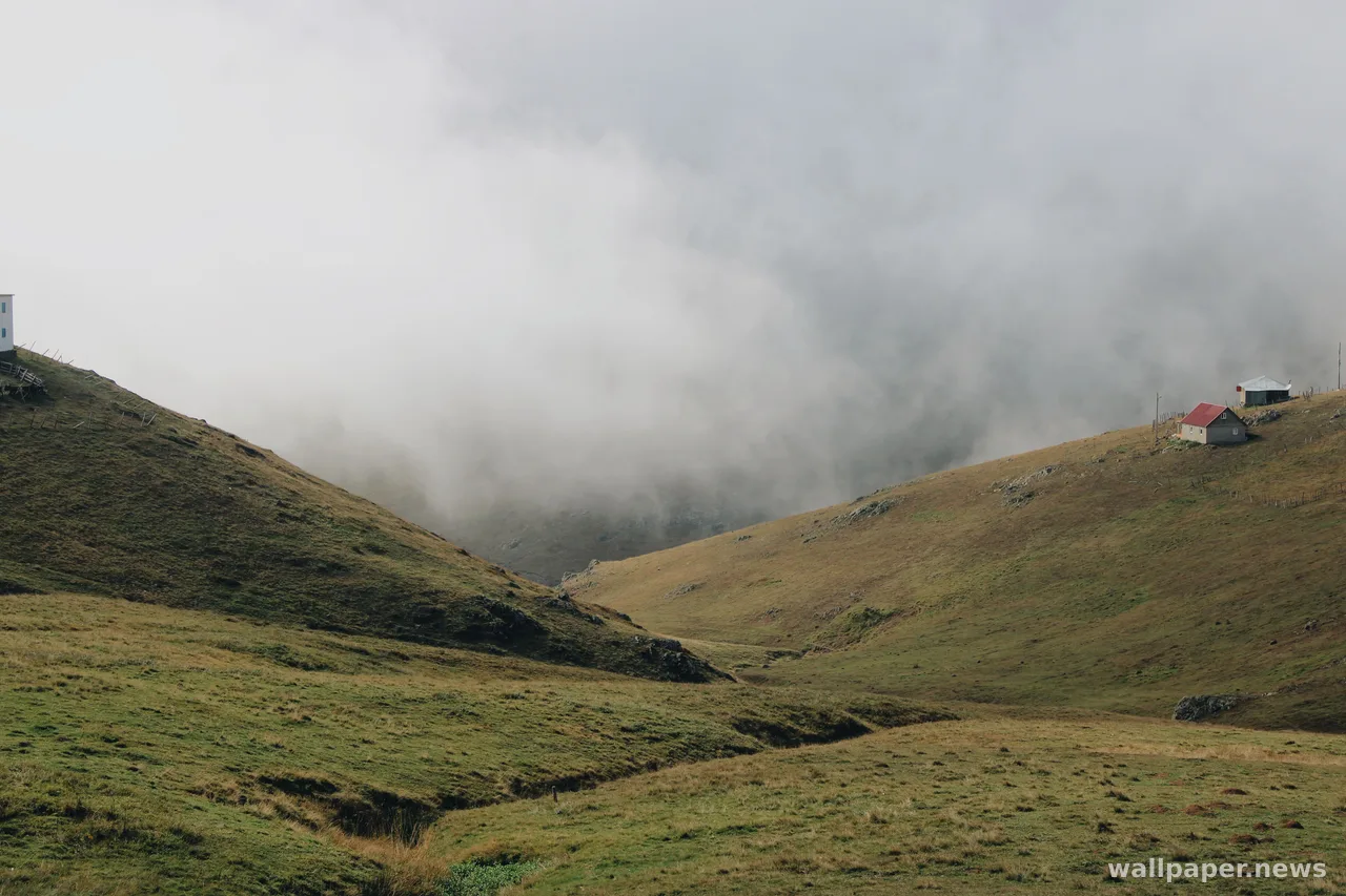
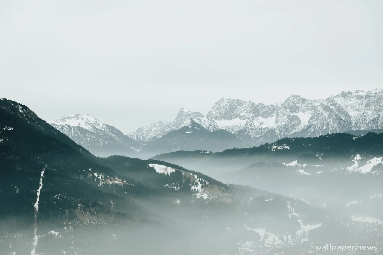
Fill, Fit, Stretch: Four Fates for One Picture
The little dropdown under every wallpaper picker decides what gets cut, what gets padded, and what gets quietly deformed.
Fill enlarges the image until it covers the screen and lets the overflow leave the frame. Fit keeps the whole picture and pads the leftover space with bars. Stretch keeps nothing out and nothing black, at the cost of changing the shape of everything inside.
The arithmetic is blunter than the words suggest. A 3:2 photo on a 16:9 display has to lose about a sixth of its height to fill the screen, usually taken evenly from top and bottom, which is why skies get shortened and horizons drift. Stretch instead widens the same file by roughly eighteen percent: circles become ovals, faces get heavier, and nothing about it looks broken until you notice it does.
Fill is the safe default, and the way to live with it is to choose pictures that keep their subject away from the top and bottom edges. Tile belongs to seamless textures, Center to small images you would rather not enlarge. The setting is not a preference so much as a decision about which part of the photograph you are willing to lose.